Article
Human-Centered Design | Synthesis, the “Secret Sauce”: Moving research data into actionable insights – Part I
* This content was originally published prior to N. Harris Computer Corporation’s 2022 acquisition of the Allscripts Hospital and Large Physician Practice business segment. Our business is now known as Altera Digital Health.
Recommended tools: Notebook, recordings (if you have them), Post-it Notes, pens, a blank wall, team members
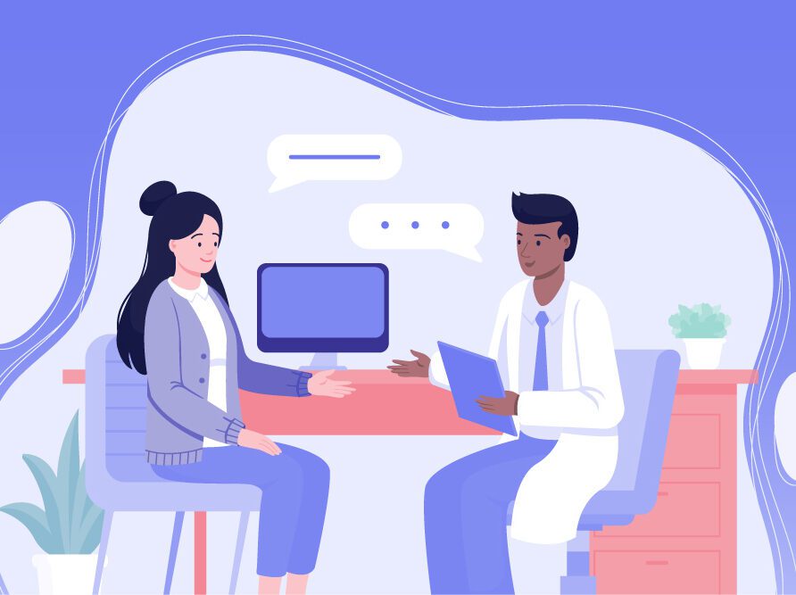
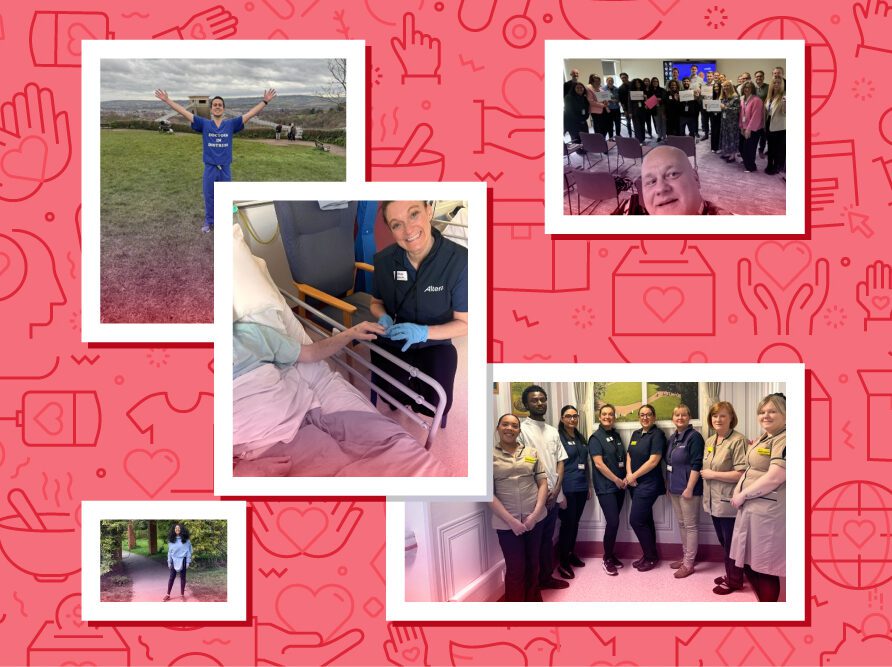
Here’s a scenario: You and a teammate (try to not do this alone, but if you are, trust the process) just went on a job-shadowing trip to three locations. Your mission was to understand what physicians do. You’ve spent close to 90 hours watching clinicians in their environment, having conversations with them, absorbing the work, the behavior, the mindset and the culture. You’ve filled an entire college-ruled notebook with what you saw and heard. Maybe you did a few sketches of room layouts, quotes from conversations and models of work, play and life. The Healthcare Industry rarely permits recordings due to HIPAA regulations, so a fast sketch hand really helps here.
Now what? You know there’s great information in that notebook. You heard and experienced so many things, some new, some validated from other work you’ve done. How do you distill all of that goodness into a few key messages? How do you educate your design and development teams about what physicians need? How are you ever going to distill 90 hours into three bullets for the executives? How do you drive change in the products and services your company creates to meet the needs of the people on the floor?
Now begins the process of analyzing and synthesizing the data found in the field. This portion of Human-Centered Design has been “the secret sauce” of the industry for decades. Jon Kolko did a beautiful job laying out the basics in his 2009 book, “Interaction Design Synthesis: Translating Research into Insights”. The good news: this isn’t rocket science. With a quiet mind and organized way of working, you can make beauty come to life from all of the information you gathered.
Keep in mind that this will not happen in one day. Patience and planning will guide you. It’s like painting a room—taping, scraping and prepping are the most important steps.
First, analyze. This means getting all the information you’ve naturally stored in your mind and body out, and into some kind of visual format. And then:
Write. Write everything from the notebook onto Post-it notes. One quote/paraphrase per Post-it. (There will be piles, and that’s a good thing!) Print out photos collected during the trip. Put the names of people you met on Post-its. Who are they? What makes them tick? Think about relationships they have, interactions between people, tools they use.
Draw. Many people come to me and say, “I’m not on artist, I can’t draw.” If you can hold a pencil, you can draw. It doesn’t have to be fancy, or perfect. Put down your inner critic and move a pencil across a piece of paper. Drawing, no matter the quality, is a wonderful way to explain to others. I also believe there’s something that happens when you move an idea or thought from head to hand by drawing. Your thought process changes, the way you see the data changes. Draw out everything you saw. Focusing on the person for whom you’re designing, looking specifically at interactions with self, interactions with others, environment, culture, sequences of actions or events. For example, draw a picture of the room(s) they work in. Draw a picture of their day from beginning to end. Where do they go, what experiences stress them, what brings them joy? Draw a picture of the culture, and what stresses are acting upon them.
Transcribe. If you have recordings, I suggest typing them out yourself. It can be tedious, but when you’re collecting data there’s so much you don’t see. Doing your own transcription will remind and surprise you. You’ll see things from a new perspective, and see things you swear didn’t happen on the floor.
Now you have everything in front of you. Your space (whether virtual or physical) is starting to look like a war room—with data everywhere!
Second, synthesize. The rest of the world thinks designers go into a room, and two weeks later (or two hours later, depending on the project) emerge with conclusions and recommendations. Although it may seem like “black magic,” it’s really not that complex. Anyone can learn this, and it’s exciting to get other members from other teams in on the fun. Invite developers, product folks and even executives to hear and witness. It will make communication that much easier in the end.
Affinity Mapping. For all of the paraphrasing and quotes, we use a method called Affinity Mapping. Affinity Mapping is the process of moving bits of data (in this case in the form of quotes) into like-subject groupings. This process enables patterns to emerge from the bottom up, resulting in a few key findings to guide design and development.
Start small. Start reading Post-its from one corner of the wall out loud to each other. Talk through each one, and start grouping like with like. By the end, you’ll have many small groupings of Post-its. Give each group a name/header on a contrasting Post-it color.
Step back. Get more coffee. Take all of the grouping headers and move the smaller groups to make larger groups looking for “like themes.” From here you’ll notice a few key findings emerge. In the end, you’ll have something like this:
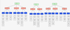
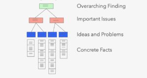
Through this process, you’ll discover new strategies, opportunities and fixes. All of these can be recommendations, considerations and conclusions for your team, your partner teams and even the strategic direction for the company.
Lastly. Congratulations! You’ve got the key findings, all of your models of behavior, tools, culture and environment, and you understand what happened and what needs to change to make your company’s product strong and effective for the people that use it. Beautiful! I’m excited to say, the job isn’t over, and actually, it has just begun. Now begins the long and rewarding process of communicating the key findings to drive product fixes and company strategy.
In Part II of this Human-Centered Design Synthesis blog, I’ll dive deeper into the key elements of communication, and discuss why it is such a vital part of this process of designing the products your audience needs most.
With gratitude.
Sources:
- Kolko, Jon (2010), “Abductive Thinking and Sensemaking: The Drivers of Design Synthesis”. In MIT’s Design Issues: Volume 26, Number 1 Winter 2010.
About the author