Article
Analytics in 2024: Making the most sense out of your data
The need for analytics is greater than ever, with more and more vendors hitting the market every day. In a recent survey from Gartner, 84% of customer service and service support leaders cited customer data and analytics as “very or extremely important” for achieving their organizational goals. But it’s easy to become overwhelmed by the amount of data available, especially when you’re working across multiple systems, each with their own reporting systems. How do you know what’s the most important? How do you combine information from multiple systems? What can you do with the decades worth of data that you have been collecting? And the most important question: What’s the best way to identify trends in your data?
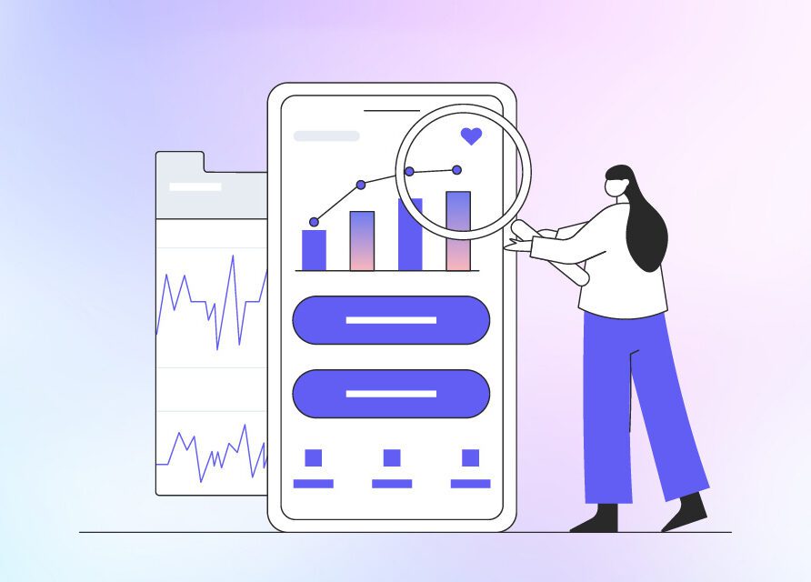
Analytical dashboards help organizations make sense of the chaos by enabling them to create a one-stop shop for their reporting needs. This type of dashboard reporting aggregates data between products into a single database. Dashboards make identifying trends simpler, enabling the user to see potential catalysts for lasting and meaningful change.
Consider the visual below. Being able to sort and arrange data is important, but perhaps the most important feature is the ability to visually present data in a logical way. This is where the aforementioned dashboard comes in.

Traditional reporting methods can still give you a clear look into the state of your business in real time. Investing in the power of analytical dashboards will make it easier than ever for organizations to consolidate and view information in such a way that any user can recognize trends and patterns in a matter of seconds. This approach also reduces the time your staff has to spend on reporting duties, as it eliminates the need to track multiple pieces of data from multiple sources.
With proper visibility into your data, your organization can ask (and answer!) questions such as:
- What is the ratio between discharged patients and patients that have received their final bill?
- What are the failed claim rates across all insurance payers in your network? Are there more failed claims with a particular payer? If so, it’s time to investigate why.
- What are the failed claim rates across your own billers? If one person regularly has a higher rate of failed claims, that could signal that something is consistently filed incorrectly and there is an opportunity to correct the issue.
At Altera, we’re in the midst of developing new analytic dashboards and I can’t wait to share more news about our Ventus solutions in the coming months. I’m truly excited to see the improvements organizations can make once they have proper reporting and visualization. To learn more about Ventus, go here.
SUBSCRIBE TO OUR INSIGHTS
Dive deeper into how we are elevating healthcare
About the author